How Geoinformation Enhances Professional Football
Introducing an Interactive Pass Map
This interactive pass map uses techniques from geoinformation science to highlight passing patterns in a new and innovative way. The visual exploration and analysis of passing patterns helps professional football clubs to understand how individual players perform and how their style affects the team performance. However, most clubs lack sufficient knowledge to analyse large and complex datasets themselves. This article explains how the pass map highlights passing patterns in an intuitive manner with a focus on geovisual analytics.
Recently, the use of spatiotemporal data has strongly increased in various fields of study, including movement ecology, transportation and health informatics. This development has led to large and complex volumes of data. In the domain of football analytics, two complementary types of spatiotemporal data are recognised, namely tracking data and event data. Tracking data refers to the positions of the players and the ball, whereas event data represents the interactions between players and the ball, such as shots, interceptions and passes. Vast amounts of such data are being captured nowadays, and techniques from geoinformation science (GISci) can potentially enhance the analysis by taking the spatiotemporal nature of football into account (Kotzbek & Kainz, 2014). The author of this article has developed an interactive pass map application to aid better understanding of passing patterns in professional football.
Limitations of traditional pass maps
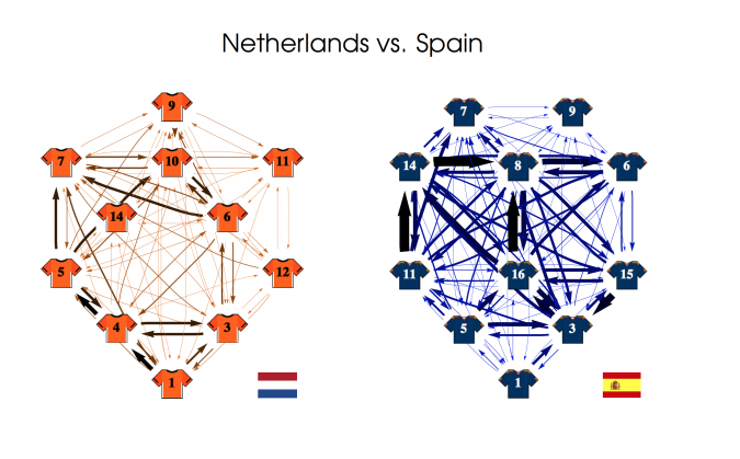
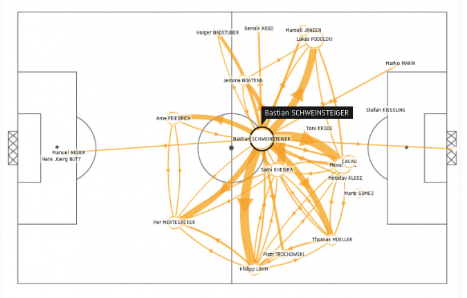
Understanding the interaction between a team of players, their opponents and the ball is one of the more important and complex problems in sports science today. Capturing these interactions is mostly done using network models, in which players are modelled as nodes and the number of (successful) passes between them as weighted directed edges. In 2012, Peña & Touchette presented a novel method to visually represent these passing networks (Figure 1). Although such a network gives a clear representation of the most used passing lanes, the visualised player positions are fixed and only correspond to the formation given on paper. Today, these networks have evolved into more advanced illustrations known as pass maps (Figure 2). In the GISci domain these maps are commonly referred to as origin-destination flow maps. In these maps, the positions of the origins and the destinations are known, as well as their attributes, but their exact routes remain unknown.
Although these illustrations provide more insight into player locations and pass intensity, there are still some severe limitations that make them difficult to read and use. First, determining the average positions based on event data means that only the interactions between the players and the ball are taken into account. Not knowing exactly how players move through space in the course of a game results in a knowledge gap that remains a critical barrier to further advancements. Second, currently available pass maps do not consider the temporal dimension of passes and thereby fail to provide a temporal account of the players’ performances.
Data handling
Data handling consists of two steps: data cleaning/pre-processing, and data visualisation. First, since it offers suitable libraries for spatial analysis and is supported by most GIS software, Python is used for the necessary data preparation and analysis tasks, including the writing of several scripts that automatically prepare the data and store it either as point or polygon feature classes. The point features are defined by a single pair of coordinates that determines the location of the origin and destination of each pass event. The polygon features are created combining the Python libraries Shapely and Pyshp with the GIS software QGIS. Geometric operations are performed using Shapely and QGIS, whereas the Python Shapefile (Pyshp) library is used to read and write Esri shapefiles in pure Python code.
Second, knowing the exact number of successful passes between any origin and destination pair makes it possible to calculate changes over time for different periods. Using proper visualisation, this data can become a very rich information source. Due to its complexity, it is almost impossible to produce a single visualisation that shows the data in all its detail without clutter and does not overwhelm the user. Therefore, the open-source visual tool Flowstrates was used to address these challenges (Boyandin, 2011; 2013). This interactive exploratory tool provides means to visually explore and analyse the spatial and the temporal aspects of the data simultaneously using visual links across different views.
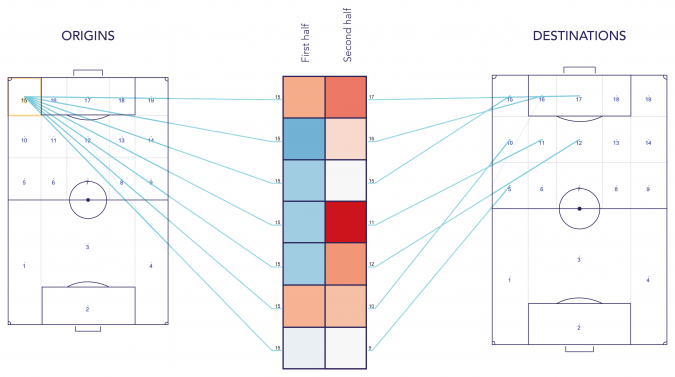
Interactive visualisation
In the application that was developed in this project, the flow origins and destinations are presented using two separate maps, whereas the temporal dimension is displayed between both maps to highlight relationships between space and time (Figure 3). Using a heat map in which the columns correspond to the different timestamps allows changes to be visualised over time, while the separate views mean that the visualisation does not have to fit into one map. Being able to see the number of successful passes, between origins and destinations, makes it possible to highlight passing patterns. In order to optimally highlight these patterns, the data was rescaled. Then, using the competition average as frame of reference, each team’s relative number of successful passes was calculated. Essentially, this transformation takes those cells containing extreme values and puts them, along with every other cell, into a certain range. This compensates for the skewness between different positions on the pitch and the variation in size between polygons and helps to reveal patterns that would otherwise remain hidden.
Furthermore, this application provides users with various interactive exploration techniques to perform relatively complex visual queries online. For instance, users can compare the temporal changes between two locations, examine changes over time for specific locations or search for the largest number of passes for any given origin-destination pair.
Revealing hidden patterns
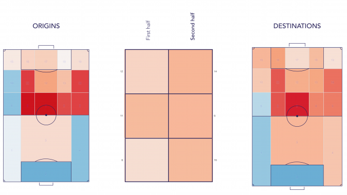
Testing of the new application revealed several interesting patterns hidden in the data. Notably, the distribution of the total incoming and outgoing number of successful passes differs between home games and away matches. For instance, Figure 4 clearly illustrates that Borussia Dortmund players send and receive more passes in the centre of the pitch when playing at home. In addition, the zones nearest to the right touchline, vertically between the halfway and 18-yard line, are used more frequently compared to the ones near the left touchline. The same type of analysis is possible when comparing different teams or even different playing styles. These results can, for instance, be incorporated into opponent analysis reports in order to better prepare teams for future matches. The results demonstrate that useful insights can be revealed and hypotheses based on these insights can be tested by football analysts.
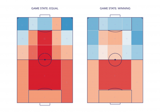
Another interesting finding is that most teams adapt their style of play depending on the game state, namely losing, equal and winning. For this application, these differences for one team were compared with the competition average and this identified deviations in passing patterns from an average team in the competition. Figure 5 shows the difference between the game states of losing (left) and winning (right) for the French team OGC Nice. Clearly, Nice changes tactics when leading by one or more goals. Instead of playing attacking football through the middle of the pitch, they adapt their style of play and try to keep possession at the back while taking little risk during their build-up play.
Concluding remarks
The proposed interactive pass map provides football clubs with a novel tool to deal with large and complex datasets by giving them the opportunity to look at the data from different perspectives and to make modifications using different interaction techniques. However, tools like these take time to develop and many iterations are needed to combine the technical and football-related components successfully. User and usability research is also highly required. Furthermore, because football is all about the usage of space and time, value can be added by highlighting, generalising and summarising patterns of spatiotemporal dynamics and answering more advanced questions regarding passing through a tool like this. At the same time, in order to fully understand how individual players perform and how their style affects the team performance, tracking data and event data will also have to be combined and analysed. As a consequence, further contributions and efforts are required to establish a new field of application within this scientific discipline and beyond.
Acknowledgements
Thanks are due to Dr Corné van Elzakker (assistant professor at the University of Twente) and Bart Aalberts (scientific researcher at SciSports) for their feedback, advice and support. Thanks also go to Ilya Boyandin for help with the source code of Flowstrates.
Data
The dataset used for this project consists of approximately four million events collected during the 2016/2017 season in five European (male) competitions: the English Championship, the German Bundesliga, the Spanish Primera División, the Italian Serie A and the French Ligue 1.
Further Reading
Van Hoeve, L. T. (2017). Geovisual football analytics: towards the development of an interactive visual interface for football coaches, analysts and players (master’s thesis). University of Utrecht, The Netherlands.
Kotzbek, G., & Kainz, W. (2014). Football Game Analysis: A New Application Area for Cartographers and GI-Scientists? In: Proceedings, Vol. 1 and Vol. 2 of the 5th International Conference on Cartography and GIS. 15-21 June 2014, Riviera, Bulgaria, pp. 299-306.
Boyandin, I., Bertini, E., Bak, P., Lalanne, D. (2011). Flowstrates: an approach for visual exploration of temporal origin-destination data. Computer Graphics Forum, 30(3), 971–980.
Boyandin, I. (2013). Visualization of temporal origin-destination data. Thesis, University of Fribourg Faculty of Science, Fribourg (Switzerland).
Gudmundsson, J., & Horton, M. (2016). Spatio-Temporal Analysis of Team Sports - A Survey. arXiv, (May),184–193.
Gudmundsson, J., & Wolle, T. (2014). Football analysis using spatio-temporal tools. Computers, Environment and Urban Systems, 47, 16–27.
Peña, J. L. & Touchette, H. (2012). A network theory analysis of football strategies. ArXiv preprint arXiv: 1206.6904, 2012.
More information
- Near Future Laboratory. Retrieved 15 September 2017, from: http://blog.nearfuturelaboratory.com/2012/07/31/footoscope-a-deciphering-tool-for-football-amateurs/
- Boyandin, I. (28 December 2011). Flowstrates: Analyzing refugee flows between two regions [Video file]. Retrieved from: https://www.youtube.com/watch?time_continue=12&v=nij8OUyiaV0
- SciSports website. Retrieved September 2017, from: http://www.scisports.com
- Website portfolio of Ilya Boyandin. Retrieved 20 September 2017, from: http://ilya.boyandin.me/works/2011/10/07/flowstrates

Value staying current with geomatics?
Stay on the map with our expertly curated newsletters.
We provide educational insights, industry updates, and inspiring stories to help you learn, grow, and reach your full potential in your field. Don't miss out - subscribe today and ensure you're always informed, educated, and inspired.
Choose your newsletter(s)


